October 25, 2008
Fall Love
Feeling in love with Fall right now. I wish we were having more beautiful jacket-weather days. I've finally started decorating for Halloween (will share later) and am going CRAZY trying to find the right costumes. I think I'll have to resort to buying on-line and express shipping...
October 19, 2008
For Friends
I spend most of my scrapping time with pictures and stories having to do with my immediate family (Eliza and Jake especially). Sometimes I get the urge to scrap about our extended family (mostly when Jake takes an incredible portrait). But lately I've realized that our friends are largely missing from my scrapbooks. So, to fill the gap with people important to us that make huge impacts on our lives...here are some pages dedicated to close friends:
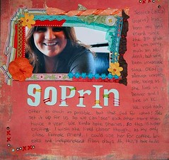
This page ended up 100% messy, but I like it anyway. The ribbon framing was scraplifted from somewhere...I don't really remember which magazine. Next time I use a framing technique like this, I won't use a photo that cuts off the subject's head! I don't care, this picture totally captures her personality!
Hooray for hybrid! I used digital elements and printed out the picture and digital elements onto 8.5 x 11 photo paper (that's as big as my printer goes). I then mounted it on traditional patterned paper, painted around the edge of the 12 x 12 and the 8.5 x 11. I then added a few traditional accents (flowers, chipboard stickers, etc.).
Hope this encourages you to scrap those missing in your record of your life!
Jessica (a.k.a. Goprin)
This page ended up 100% messy, but I like it anyway. The ribbon framing was scraplifted from somewhere...I don't really remember which magazine. Next time I use a framing technique like this, I won't use a photo that cuts off the subject's head! I don't care, this picture totally captures her personality!
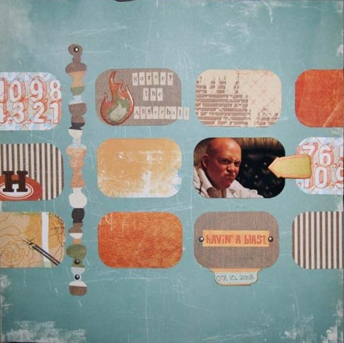
Harvey the Angerball
Speaking of personality, the "angry scrunched nose" look couldn't be anymore Harvey. I love this layout because it's so versatile. You could easily substitute more photos for the patterned paper rectangles. This would also stretch to a double pager easily.Steve
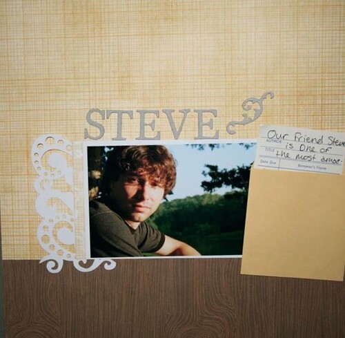
Jake took this portrait of our friend Steve at a lake, so I tried to keep the page natural. I slipped the journaling into the library card.Sami
Hooray for hybrid! I used digital elements and printed out the picture and digital elements onto 8.5 x 11 photo paper (that's as big as my printer goes). I then mounted it on traditional patterned paper, painted around the edge of the 12 x 12 and the 8.5 x 11. I then added a few traditional accents (flowers, chipboard stickers, etc.).
Hope this encourages you to scrap those missing in your record of your life!
October 17, 2008
Happy Autumn!
It went from hot to freezing really quick in KC, so this post is my attempt to reclaim my favorite season. Maybe it will also get me in the mood for Halloween decorating! Here are some layouts from Halloween/fall from the past:
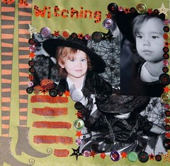
Little miss Eliza as a witch last year. I thought the title was cleaver, but probably it's not really. The buttons are glued on with orange acrylic paint. Using small things like buttons (traditional and chipboard), brads, eyelets, snaps, or paper scraps to frame a photo block is a great way to pull all of your photos together. It also has the added bonus of helping you to clear out your stash (I have more of those little star brads than I could ever use). I also glued some Queen & Co beads onto the letter stickers because the neon orange was way to bright for the layout.
"Pumpkin Patch"
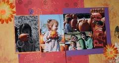
We went to the Red Barn Farm in Weston in '07. Eliza was very excited to pick out her own pumpkin and insisted on carrying it around the entire time we were there. Learn how to color one part of a black and white photo using Photoshop, like I did with the photo on the far left, here.
Another fun technique used on this layout was taken from CK October 2007. I put the second part of the title on top of a close-up photo. This took a little planning-ahead, since we normally don't take a lot of artistic close-ups. I covered the chipboard letters in patterned paper by first gluing the letters face down to the paper. Then I cut around them with a craft knife and inked the edges. I always ink when I cut with a craft knife since it hides all of the little mistakes in my cutting. Because the letters were so big, I put my journaling right on them.
The last thing you can take from this layout is a secret weapon I use to make double page layouts work for me. I'm usually a single page gal, but I often go to double pages for holidays or events in order to incorperate more photos. However, I think with a single-page mindset when I'm buying paper. I almost never buy two of the same paper. This makes it hard for me to make a double pager that feels cohesive. My solution for this layot was to find two coordinating peices of patterned paper and cutting them so, when adhered toegether, they made a full 12x24 page. I cut both peices 4x12 and 8x12, but you can play with the demensions. To hold it all together, I adhered the patterened paper to cardstock that I knew I'd never use.
2006
"Eli's First Pumpkin"
My Uncle Frank has a garden and was nice enough to let Eliza come pick out a pumpkin from him. We took Jake's little brother Corbin along too. It was nice to have first pick becuase that was seriously the perfect pumpkin. Even though these photos are from '06, I just did this l/o yesterday. If you haven't noticed, I don't worry about doing things in order.
I had the double page challenge with this l/o again. I wanted to frame both photo blocks in patterened paper, but didn't have enough of anything I liked. The solution? I just cut strips from paper I liked and used them instead! I colored the space between the photos and the strips black with a marker becuase I didn't like the green from the cardstock and the green from the grass next to each other.
Jake and Corbin as Captin Hook and Mr. Smee. We did this group theme for Halloween in '06. I was Peter Pan, Jake was Captin Hook, Corbin was Mr. Smee, my sister Tayor was Wendy and Eliza was Tinker Bell. We've tried to keep up this and make it a tradition. I'm sure Eliza will be mortified when she grows up, but it's cute now.
My Mom made the costume. How awesome is that? I wish I could sew...
I also did this one yesterday. I'm trying to scrap picture's I've already printed off to avoid buying new ink for my printer. Not to mention the photo matched the lovely Basic Gray I've been stock pileing. Even though the picutre is from when I was pregnant with Eliza, the journaling focuses on us trying for Baby Anderson #2 now. Sometimes it helps when journaling less recent photos to tie them back into the present.
Now I'm certainly inspired to go decorate, I hope I gave you some autumn inspiration as well!
2007
"Be Witching"
Little miss Eliza as a witch last year. I thought the title was cleaver, but probably it's not really. The buttons are glued on with orange acrylic paint. Using small things like buttons (traditional and chipboard), brads, eyelets, snaps, or paper scraps to frame a photo block is a great way to pull all of your photos together. It also has the added bonus of helping you to clear out your stash (I have more of those little star brads than I could ever use). I also glued some Queen & Co beads onto the letter stickers because the neon orange was way to bright for the layout.
"Pumpkin Patch"
We went to the Red Barn Farm in Weston in '07. Eliza was very excited to pick out her own pumpkin and insisted on carrying it around the entire time we were there. Learn how to color one part of a black and white photo using Photoshop, like I did with the photo on the far left, here.
Another fun technique used on this layout was taken from CK October 2007. I put the second part of the title on top of a close-up photo. This took a little planning-ahead, since we normally don't take a lot of artistic close-ups. I covered the chipboard letters in patterned paper by first gluing the letters face down to the paper. Then I cut around them with a craft knife and inked the edges. I always ink when I cut with a craft knife since it hides all of the little mistakes in my cutting. Because the letters were so big, I put my journaling right on them.
The last thing you can take from this layout is a secret weapon I use to make double page layouts work for me. I'm usually a single page gal, but I often go to double pages for holidays or events in order to incorperate more photos. However, I think with a single-page mindset when I'm buying paper. I almost never buy two of the same paper. This makes it hard for me to make a double pager that feels cohesive. My solution for this layot was to find two coordinating peices of patterned paper and cutting them so, when adhered toegether, they made a full 12x24 page. I cut both peices 4x12 and 8x12, but you can play with the demensions. To hold it all together, I adhered the patterened paper to cardstock that I knew I'd never use.
2006
"Eli's First Pumpkin"
My Uncle Frank has a garden and was nice enough to let Eliza come pick out a pumpkin from him. We took Jake's little brother Corbin along too. It was nice to have first pick becuase that was seriously the perfect pumpkin. Even though these photos are from '06, I just did this l/o yesterday. If you haven't noticed, I don't worry about doing things in order.
I had the double page challenge with this l/o again. I wanted to frame both photo blocks in patterened paper, but didn't have enough of anything I liked. The solution? I just cut strips from paper I liked and used them instead! I colored the space between the photos and the strips black with a marker becuase I didn't like the green from the cardstock and the green from the grass next to each other.
"Walk the Plank"
Jake and Corbin as Captin Hook and Mr. Smee. We did this group theme for Halloween in '06. I was Peter Pan, Jake was Captin Hook, Corbin was Mr. Smee, my sister Tayor was Wendy and Eliza was Tinker Bell. We've tried to keep up this and make it a tradition. I'm sure Eliza will be mortified when she grows up, but it's cute now.
"Belle Tink"
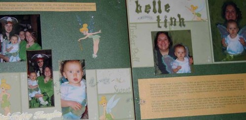
My Mom made the costume. How awesome is that? I wish I could sew...
2005
"Glow"
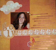
"Glow"
I also did this one yesterday. I'm trying to scrap picture's I've already printed off to avoid buying new ink for my printer. Not to mention the photo matched the lovely Basic Gray I've been stock pileing. Even though the picutre is from when I was pregnant with Eliza, the journaling focuses on us trying for Baby Anderson #2 now. Sometimes it helps when journaling less recent photos to tie them back into the present.
2004
"Escape"
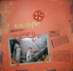
"Escape"
Now I'm certainly inspired to go decorate, I hope I gave you some autumn inspiration as well!
October 15, 2008
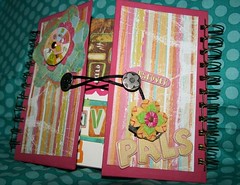
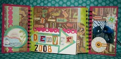
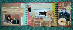
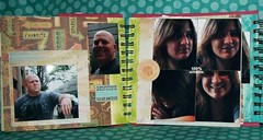
Denver!!!
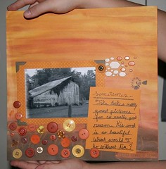
As promised, some of my (finally finished) Denver mini. Jake and I went to go visit my best friend Jessica, who lives there, with our other best friend, Harvey.
The mini is by K & Co and uses mostly the K & Co Urban Rhapsody line (also featured prominently in my Nov. 4th class here)!
P.S. I did most of the mini in the car on the way to Denver, so I just had to add pictures, journaling and a few accents when I got back. I unraveled the spirals and painted the covers and the edges of the pages before the trip and put it back together after it dried.
October 13, 2008
Mojo 23
It has been a while since I have done any on-line challenges... but this one was too fun to resist! The Got Mojo? challenge this time around was to a) scrap your fav Halloween costume and b) make your own accent. Head on over to play along, but this one is due Oct 15.
Here's my take:
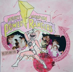
I loved this costume as a kid because the Power Ranger gloves made sounds when I made a fist. WHOOSH! SWOOSH! The Power Ranger is a coloring book page I found on-line. I just printed it out on white cardstock, painted it pink with watercolors and carefully cut it out. The title I drew from a pic (also found online) and colored with crayons. I tend to break out the school-type craft mediums when scrapping my childhood because it helps me remember. I also made the paper design. Just lightly swipe paintbrush over cardstock with watercolors and flick watercolor drops. This warps the paper a little, so if you try this, put it under something heavy for a while after it dries.
Subscribe to:
Posts (Atom)