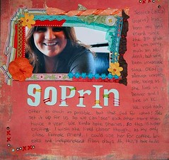
Jessica (a.k.a. Goprin)

This page ended up 100% messy, but I like it anyway. The ribbon framing was scraplifted from somewhere...I don't really remember which magazine. Next time I use a framing technique like this, I won't use a photo that cuts off the subject's head! I don't care, this picture totally captures her personality!
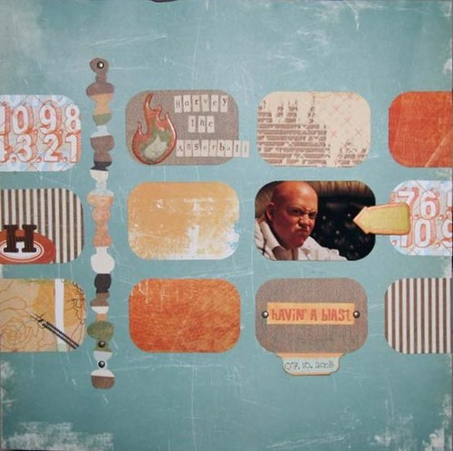
Harvey the Angerball
 Speaking of personality, the "angry scrunched nose" look couldn't be anymore Harvey. I love this layout because it's so versatile. You could easily substitute more photos for the patterned paper rectangles. This would also stretch to a double pager easily.
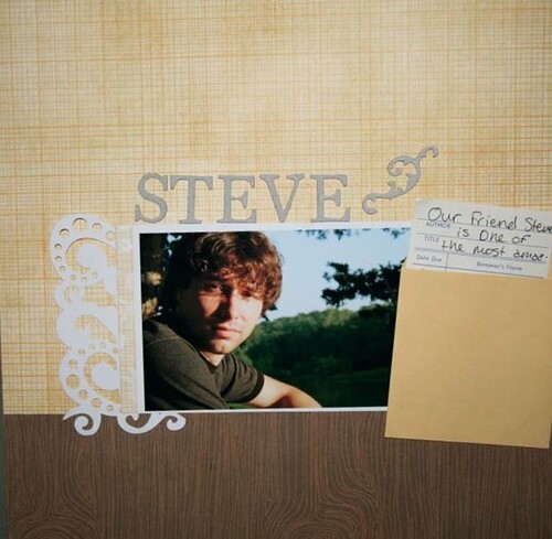
Steve
 Jake took this portrait of our friend Steve at a lake, so I tried to keep the page natural. I slipped the journaling into the library card.
Sami

Hooray for hybrid! I used digital elements and printed out the picture and digital elements onto 8.5 x 11 photo paper (that's as big as my printer goes). I then mounted it on traditional patterned paper, painted around the edge of the 12 x 12 and the 8.5 x 11. I then added a few traditional accents (flowers, chipboard stickers, etc.).
Hope this encourages you to scrap those missing in your record of your life!


No comments:
Post a Comment