April 30, 2009
Got Mojo #33: Peter Pan+Frame
I love the most recent challenge over at Scrap Mojo! The challenge was to use ANYTHING from Peter Pan that YOU love and use a frame some where some how on your page. I thought it was a great opportunity to get to working on my project described on this post .
A little mermaid love!
I painted the canvas, added some of the mermaids and a page out of a Peter Pan from Elsie's Neverland kit at her etsy, elsiecake. I also drew one of my very own mermaids:
I used acrylic paint for her skin so you couldn't see the words, and then colored the rest with sparkly Crayolas. The other mermaids are colored in with crayons as well. I think my favorite part is the buttons :) I didn't have a frame I liked for the challenge, so I used them to make one.
And, since I'm sharing, here's some other things I've done with the kit:
I'm so excited to finish all of these! They're going to look great hanging together!
P.S. Thank you Jake for taking the pictures of these and for doing the fun spotlight effect on the first photo. Love you honey!
April 28, 2009
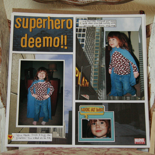
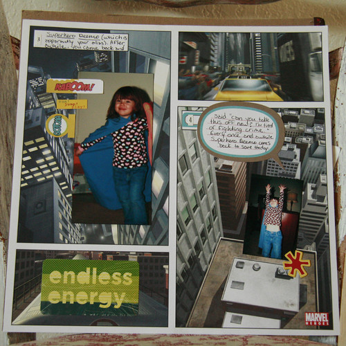
Superhero Deemo!
I hope she won't get mad at me for letting everyone know her secret identity, but Eliza is really a superhero!
She just came up to us one day, asked us to tie a pillowcase around her neck and started running around going "Superhero Deemo!" She stopped after awhile, asked us to take it off, and told us "I'm tierd of fighting crime". She's such a goose. She pretends to be Superhero Deemo at least once a week :)
April 27, 2009
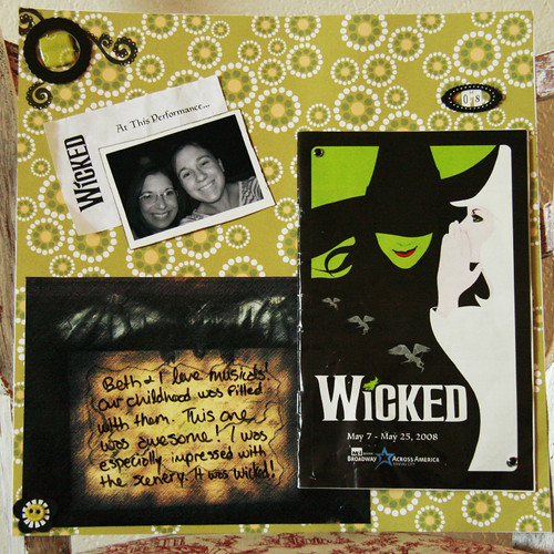
The Creative Type #15
For a fun challenge over at The Creative Type:
The challenge was to journal directly on your photo, which I do all of the time, so I extended the challenge to myself to make a photo just for the journaling! The journaling block is actually a photoshoped picture of the stage. I had every intention of sewing a spot in the page protector for the playbill, but got lazy and attached it with brads instead. Just so you all know, it also took a ton of bravery to put that photo on the page! I think I look pretty darn horrible, but I'll live.
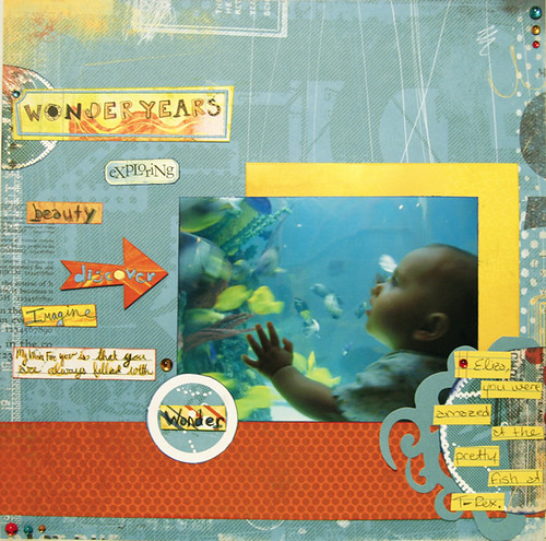
Wonder
Thought I'd share. I am in love with this page!
I've been scrapping a lot of Eliza's baby pictures lately, as there's a gap of about eight months where there aren't very many at all. That was before I realized that it is not necessary to scrap in chronological order and that you don't have to scrap every single photo. I've been having a lot of fun looking back at the photos and memories from when she was so tiny. I've also found the realization that it is not necessary to stick with baby colors or baby themed products quite freeing. There will be more baby love to come!
April 25, 2009
Inspired by Amelie #12
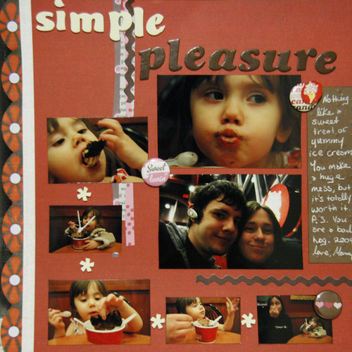
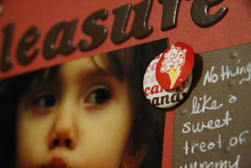
As always, the ladies over at Inspired by Amelie didn't fail to inspire! The current challenge was to scrap about life's simple pleasures. As I've already done a simple likes/dislikes page inspired by the narration in Amelie, I opted to do a page about the most recent simple pleasure we enjoyed as a family... ice cream!
Yum! Posting this has made me hungry... I need to go raid my freezer!
April 24, 2009
The Art is Found: Green Grass
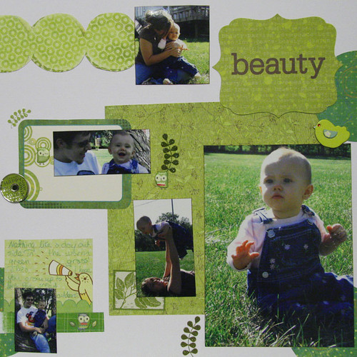
How did I spend my Earth Day? Well, I made this page (among other things) for a challenge at The Art is Found. The prompt is green grass.
I challenged myself to use only scrap paper, which made my husband Jake super happy, because he's always telling me that it's called SCRAPbooking for a reason. This is because I have a spending problem. Don't we all? Anyway, using scraps is a great way to use your stash. I try to check my scrap box before I cut into a new sheet of paper, but creating with nothing but scraps was challenging. I kept having to repeat to myself that it doesn't matter that the greens don't match perfectly...
April 23, 2009
Use Those Class Pages!
I know that a lot of the girls that take classes at The Scrapbook Page just let their class pages build up without adding those last steps of photos and journaling. I'm going to assume that's a universal problem among those of you that take classes or workshops that don't include the add-the-photo steps. But I'm here to tell you that with a little luck and a lot of Un-du, you can get those pages into your albums in no time! I've used some of the pages from classes I've taught in the past to give you some tips and tricks on using those class pages!
One of the biggest problems with classes is that the pages don't always seem to fit with the shapes and sizes of your photos. There are a few ways to tackle this easily.
1. Crop the photo.
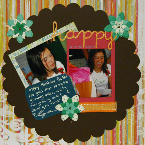
Here, I had a vertical 4.5x6.5 photo mat, but my photo was horizontal. I cut my photo down to 4x4 and used the top of the photo mat for my title. You could also put journaling or an extra embellishment in the space left for the photo mat. Can't make it work? Grab that Un-du and flip or trim the photo mat instead. You'll also notice that I made this generic page into a themed page. Class pages are great to turn into themed pages, becuase you're most likely to run out of inspiration on things that you scrap all of the time, like birthdays.
2. Ignore the photo mats.
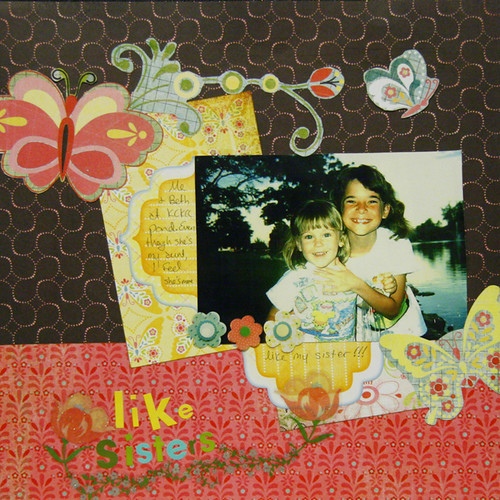
I liked these patterend photo mats too much to cover them up. I also wanted my photo to take center stage, so I didn't want to tilt it with the other elements. So I just treated the photo mats like part of the background and added journaling stickers to them (the sticker is actually cut in half). You'll also notice some extra elements, like the flower stickers and the journaling sickers, that weren't part of the class. Don't be afraid to add to class pages to jazz them up and make them your own.
3. Put the photo on the mat even if it's going in the wrong direction.
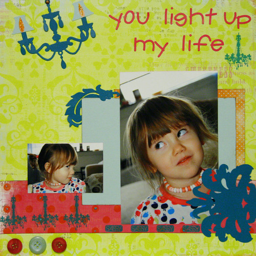
On this page, instead of trying to crop the photo (which would not have really worked with this head shot) or flip the mat (which looked pretty silly), I just put the vertical photo on the horizontal mat without worrying about it. I used the extra space on the mat for an extra small photo. Notice I also added rub-ons to this page that weren't originally there. I love embellishments, and putting more of them on class pages makes the pages stand out from the other pages in my albums less.
Another common problem with class pages is that there just isn't enough space on them for all of the photos you want to use. While I usually recommend just picking the best photos to let your story shine, sometimes you just need more. Here are a few tips on squeezing extra photos into your class pages.
1. Let a photo mat do double duty.
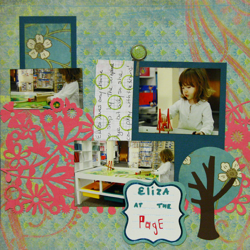
In this (unfinished) page above, I used some of the tricks for wonky photo mats to squeeze two photos onto one mat. I cropped the first one to fit inside the vertical mad and I didn't worry that the second one was completely within the confines of the allotted space. I can't wait to make a train image on my Silhouette so I can finish up the title on this page!
2. Shrink your pictures.
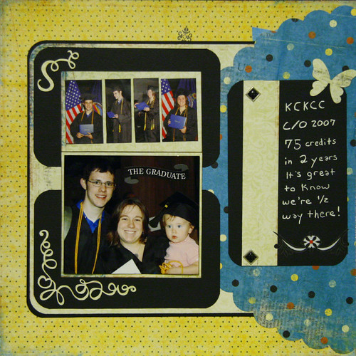
There was no way I was fitting five full-sized photos on this page, so shrinking them down was the way to go. Because the photos were dark and didn't contrast enough with the black mats, I added another off-white mat.
3. Stretch the layout into a double pager.
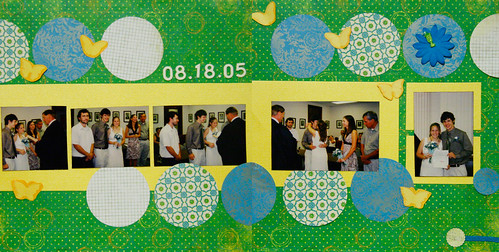
The left side of this double page layout was the original class page, and I just stretched the original design. It's also easy to mirror the original design. It's best to know that you want to turn the page into a double pager during the class, when the supplies are more likely to be available.
4. Turn photo mats into journaling blocks.
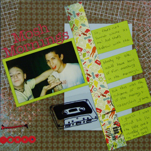
I'm sure it's rare, but sometimes you have too many photo mats and not enough photos. The solution here is simple. Use the space for journaling! You can also use the mat to add a title or extra embellishments.
P.S. Another class tip? Scraplift your class pages! I based this page on the page above. No one will ever know that two pages in your album are based on the same design! I scraplift myself all of the time.
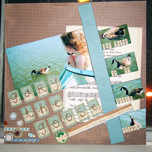
If you have any scrapbooking questions or problems, leave me a comment or e-mail me! Maybe my next post will answer it!
April 22, 2009
Disney Mini for Mo
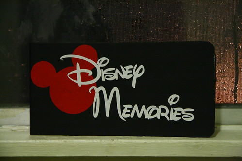
I recently created a little Classic Disney mini-book for my friend Mo at The Scrapbook Page. She's currently taking her recently retired dad on a trip to Disney, and needed a reason to make him take pictures with the characters. Hopefully, this mini will give her dad some instant gratification as well while she is working on scrapping the trip.
I kept it super simple (which we all know is rare for me). It made for a nice change.
I made the cover on my QuicKutz Silhouette using vinyl. I made the Mickey head myself using the welding function on the Silhouette. It's super easy to just weld together a couple of circles, I'm hoping to graduate toward making my own more complicated shapes soon. If you have any questions about anything QuicKutz or die-cutting related or are just curious, head over to Mo's blog.
If you like this mini, you might also like my upcoming Princess Autograph Book class at The Page. I'll be posting more pics of this class soon.
April 21, 2009
I'm Back + Category Stories
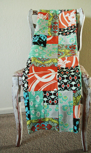
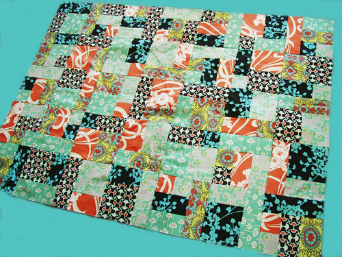
I'm back! I didn't ruin the lovely fabric (yay)! The quilt went a lot faster than expected, so I spent most of the weekend writing. Here is is (without backing or a boarder because I have yet to buy the fabric for the rest of it):
It's busy and oh so very us.
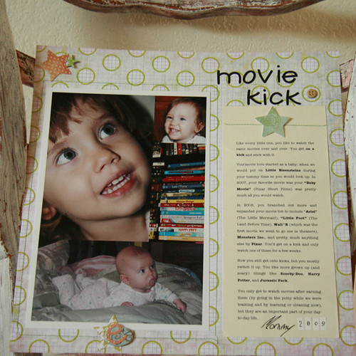
To get back into the swing of things, here is a page for a challenge over at Category Stories. The challenge was to scrap about going to the movies, but since I've scrapped plenty about that, I decided to write about Eliza's life in movies:
This layout was inspired by Ali Edwards. You'll notice I broke out the sewing machine. I think that I'll have trouble putting it away after last weekend!
April 15, 2009
I'm off like a heard of turtles.
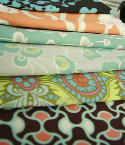
Or at least that's what my Grandma would say. I'm going to Warsaw tomorrow with my mom on a quilting weekend. I'll be making my very first quilt. I'm going to try my darnedest not to ruin this gorgeous fabric from Urban Arts and Crafts:
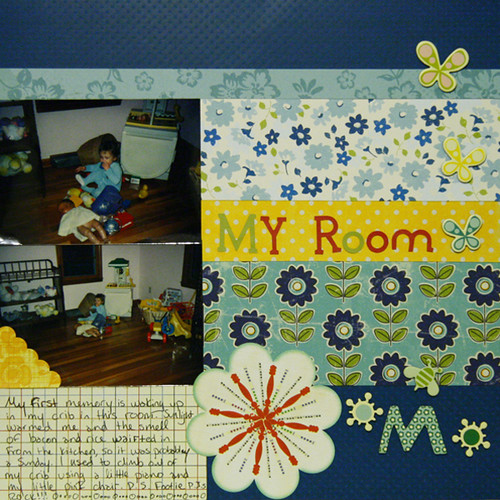
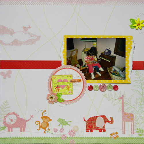
A little Anna Maria Horner and a lot of Amy Butler! I'm looking forward to a fun weekend with some batty old ladies, so I won't see you again until Sunday night! Here's some fun layouts using some old childhood photos I dug up. This should tide you over, right?
I'll miss you! Wish me luck!
A little Anna Maria Horner and a lot of Amy Butler! I'm looking forward to a fun weekend with some batty old ladies, so I won't see you again until Sunday night! Here's some fun layouts using some old childhood photos I dug up. This should tide you over, right?
I'll miss you! Wish me luck!
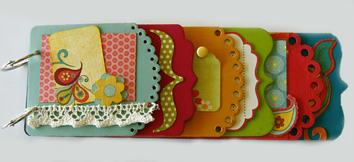
April Classes at the Scrapbook Page!
They're coming up soon, so I thought I'd share my upcoming classes at The Scrapbook Page with you!
Here's a peak of my April 23rd Mini Madness - Spring Forward class.
I love how bright and fun this mini is! It's perfect for spring.
While I'm at it, here's a sneak peak of my April 30th Inspiration Vacation - Architecture class. You can catch a full page example, as well as a class description, at the provided link.
You can sign up by calling the Page at 913-383-1552. I've also recently found out that they will ship kits, so if you don't live around KC you can still have these fabulous projects for your very own!
April 14, 2009
Category Stories: Bedtime Rituals
A page for the April 1 prompt at Category Stories. The challenge was to scrap about a bedtime ritual. I was going to do a page about my bedtime ritual of reading before bed, but Jake captured this amazing moment of Eliza and i had to scrap it!
The page is a little blurry, so here's the journaling:
Eliza, we always read a book to you before bed. Lately, you've developed a habit of begging us to keep the light on for a little while when we're done so you can "read" (look at the pictures)by yourself. No doubt, this is a mommy mimicking habit, because I HAVE to read before I sleep. However, the side effects are that we find you like this...
Scrapping Across the Universe #12
This is a page for the challenge blog Scrapping Across the Universe. The prompt was to scrap secrets from your past! I chose to write about past and present secrets that were all at least slightly funny.
In case you can't read my horrible handwriting, here's the journaling:
I sing loud in the car.
I'm a sucker for poetry, even if it's bad.
I loved Twilight and read the whole series in a weekend, even though I said I wasn't going to read them.
I am in pajamas 90% of the time.
I was late to my own wedding.
I once had blue hair.
I like to prove people wrong.
I also made another Across the Universe inspired page while watching the movie working on the above layout:
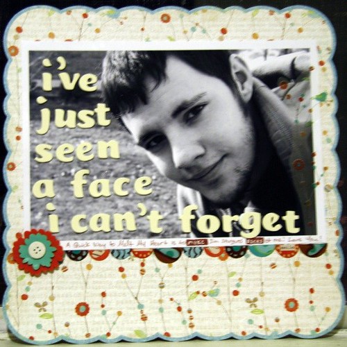
Journaling: A quick way to melt my heart is to make Jim Sturgess faces at me! Love you!
April 12, 2009
Happy Easter!
Happy Easter to all of you who celebrate! I'm feeling a little under the weather and accidentally took some daytime medication, so I'm experiencing a bit of insomnia. I felt that sharing this fun page was a better use of my time than tossing and turning.
I love the photo on this page because Eliza's face is so darn cute and Jake is in it taking the picture, as usual. The journaling describes Eliza's obsession with the Easter Bunny last year. She is much more enamored by him than by Santa Claus and couldn't understand why he couldn't come back when she ran out of jellybeans.
April 11, 2009
Sneak Peak
A little canvas using some of the fabulous goodies + inspiration from Elsie at her Etsy. I loved this Neverland Kit, and have been saving it for something wonderful.
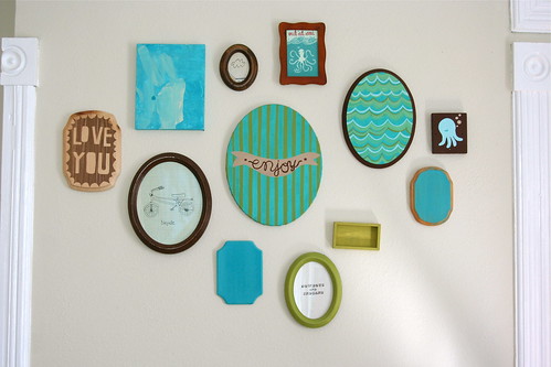
This mixed media painting is only one in a series... we are currently redecorating our bedroom and I am using this wonderful grouping from Rachel as inspiration:
I may be sharing more, but hopefully I'll be able to hold out until you can see the finished product!
This mixed media painting is only one in a series... we are currently redecorating our bedroom and I am using this wonderful grouping from Rachel as inspiration:
I may be sharing more, but hopefully I'll be able to hold out until you can see the finished product!
April 10, 2009
The Creative Type #14
Last post today I swear! I've been saving them up waiting to take pictures. You're going to get slammed with some eye candy this weekend now that they're all taken.
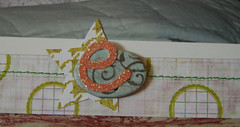
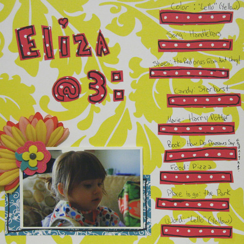
The current challenge up at The Creative Type is all about the @ symbol. Thanks to their prompt, I had the Beck song Where It's At stuck in my head the whole time I made this:
I spent forever on my computer trying to pick a font that I liked for both Eliza's name and the at symbol to no avail. I ended up drawing my own letters with a Sharpie and cutting them out by hand. I know, crazy for someone with a Silhouette, but I think this was the right feel. I carried the Sharpie outlining on throughout the layout.
P.S. It was really fun quizzing Eliza on her favorites! I bet if I asked her tomorrow, she'd say something totally different...
Got Mojo? 32
Here's my stab at the current challenge up at Got Mojo?:
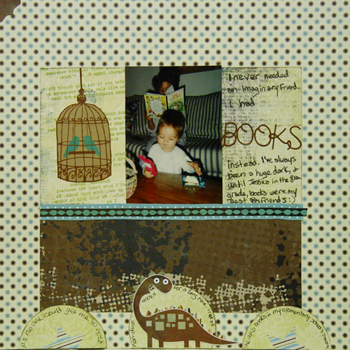
The challenge is to a) make a page about your imaginary friend (or ideal one, if you don't have one) and b)use an animal crackers box for inspiration.
I didn't have an imaginary friend, so I decided to make a page about why I didn't have one... I had books instead! I love to read, and characters in books have always been sort of like imaginary friends to me. The photo corner in the top left of the page and the half circles at the bottom are thanks to the animal crackers box.
Just in case you're wondering and can't read my handwriting... the dinosaur at the bottom of the page is because I read pretty much nothing but dinosaur books when I was little. I read every single book in my elementary school's library and my mom always made me get one non-dino book for every two dino books at the library. As can be seen in previous posts, I've passed the dinosaur love onto little Eliza...
Dare 134: If I Won the Lottery
My take on this week's challenge at The Dares:
Instead of writing about what I would do if I won, I asked Jake to write down what he would do. I like his doodles. I also used an actual lottery ticket someone gave us last Christmas, which Jake now informs me would have won us a few dollars. Oh well, most of the embellishments I use cost that much, so I'm not too disappointed!
April 6, 2009
I fibbed...
So, I meant to reveal some surprises this weekend, but didn't get around to taking pictures of them! I PROMISE is will share within the next few days.
Meanwhile, how about enjoying a nice green layout?
This is a page documenting Eliza's favorite song: "Handlebars" by the Flobots.You can't see it very well, but I thought the Basic Gray paper with bicycles was appropriate! I also loved using crayons for the boarder. It gives the layout a youthful feel. It's always fun to just start coloring!
Subscribe to:
Posts (Atom)